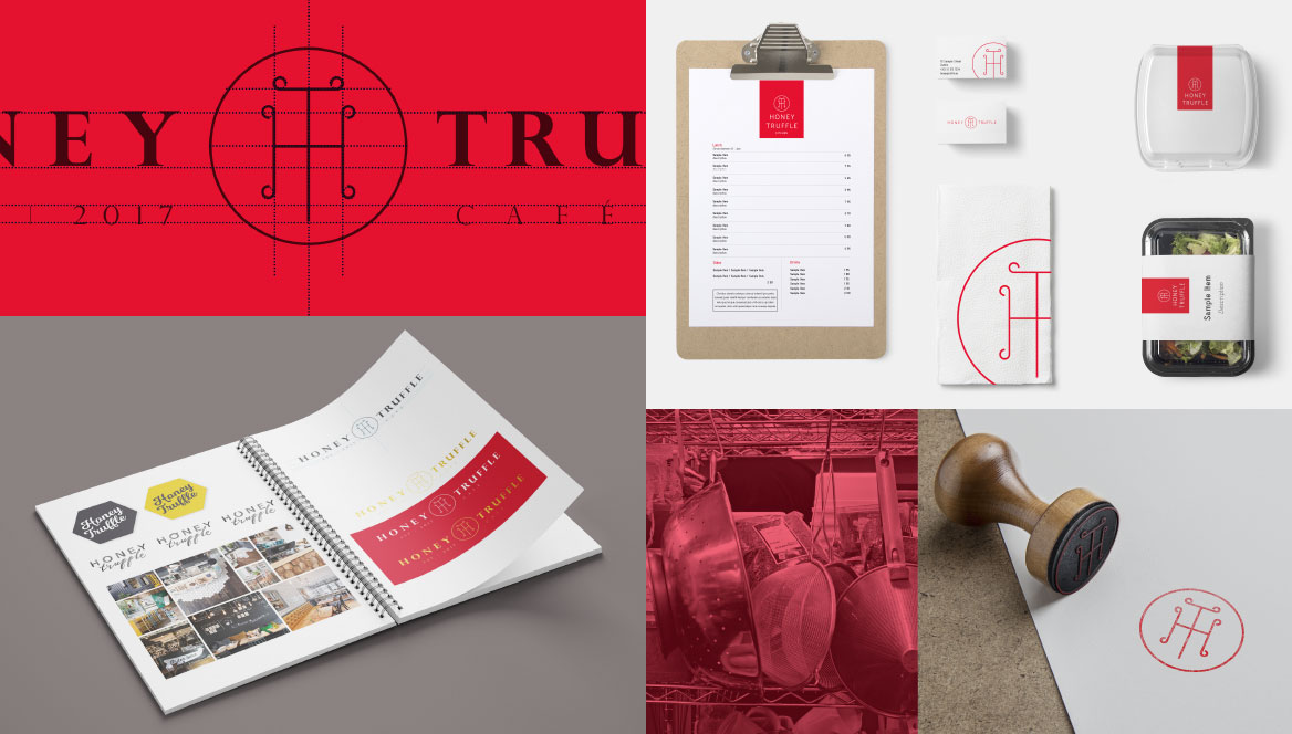
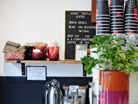
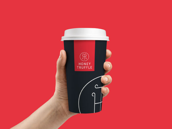
At the initial discussion in the building site, it became apparent where to position the brand in this very competitive market. Every menu choice, piece of furniture and light switch was chosen with style and consideration.
This brand needed to reflect the owner’s vision and ambition.

The Logomark design process
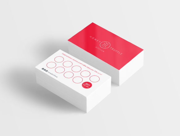
The name had been chosen and an URL secured from the outset. We presented style boards reflecting the target audience and to gauge which design range resonated. Once a direction was agreed, we got to work on the mark. Through research and sketching, the idea of a monogram emerged and was developed. It became very appealing to explore further as it carried all the hallmarks of quality and style, which was exactly the brand qualities we were looking to project. Fonts and weights were optioned to get the balance of refined style and modern cool. The brand would have to work on everything from signage to business cards.
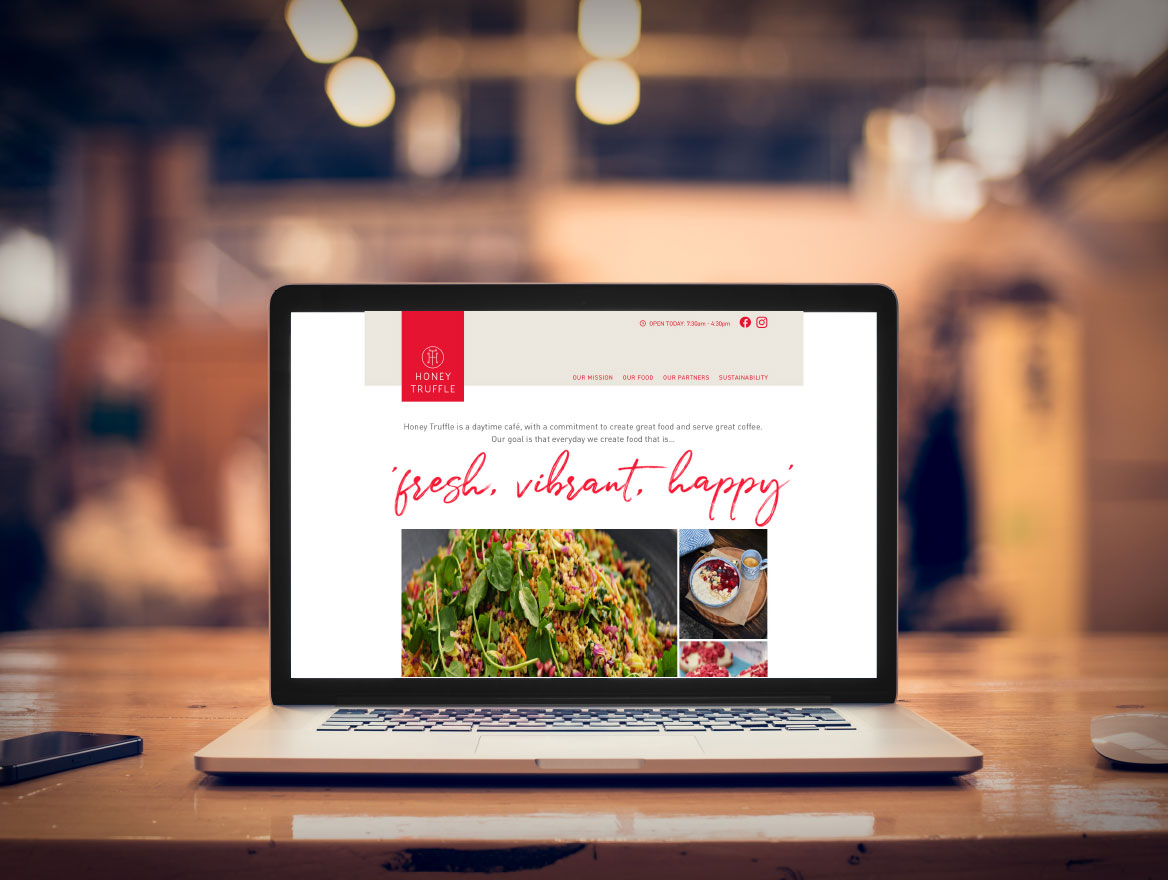
 Walker has been instrumental in creating a vibrant, strong and recognisable brand for Honey Truffle. This has been combined with creative marketing concepts.


