Dermot Casey Brand
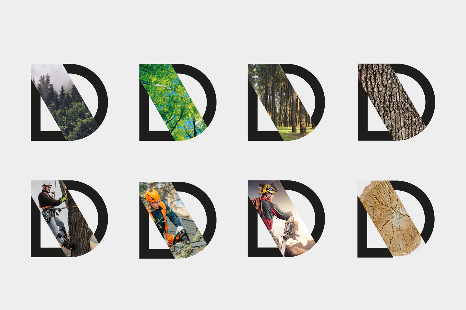
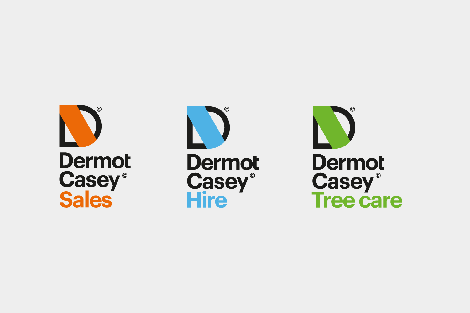
We are proud to showcase our new Dermot Casey brand! When it comes to a rebrand, we needed to make sure it would not isolate existing customers, also it would need to fit in with the company’s values and personality. The goal was to create something new yet familiar—more of an evolution.


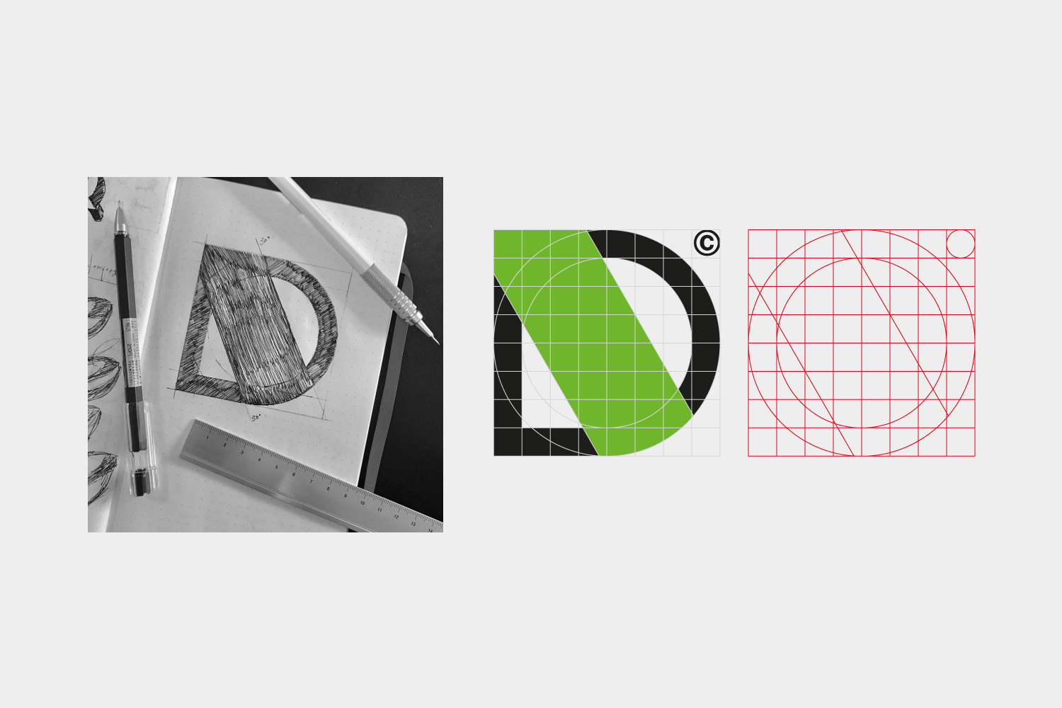
A lot of the existing communication has quite a large graphic green angle within it. We altered the angle to 30º allowing for better use and to be more in line with tree cutting. The D icon is shaped within a square in an 8x8 grid, this needed to be perfectly cut out to mirror the quality and clean cuts of Dermot Casey.


