Initial discovery meetings were held to inform the agency about strategic power projects. These meetings were full of questions to help determine parameters and clarify the vision to be reflected in the brand development. The subject matter and company purpose lead to a concept of clean space and air.
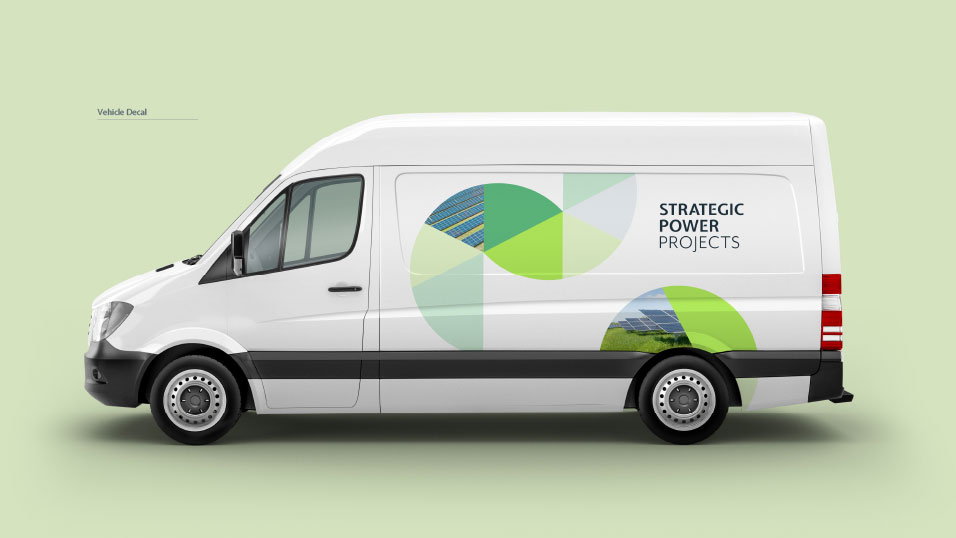
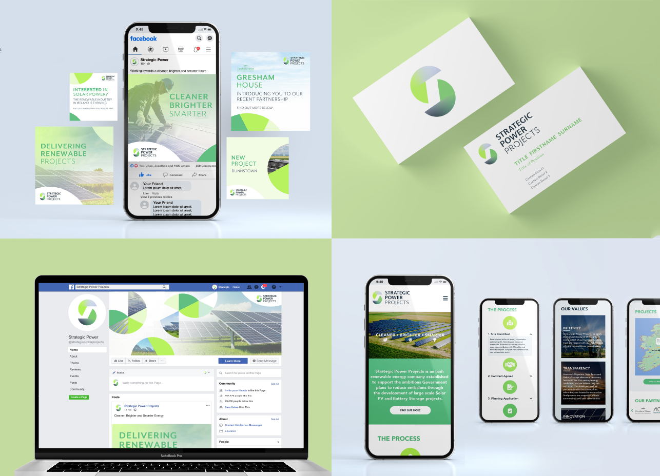
A logo mark was produced to represent the brand in the simplest form. Using organic colour blends and a fragmented ‘S’ the brand would become a recognisable symbol from large scale signage to the smallest social icon. The colour scheme and typography were designed to subtly reinforce the environmental message.
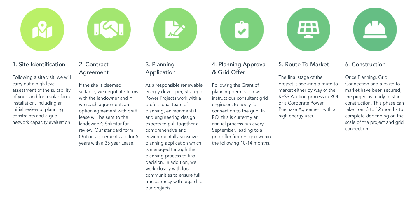
Once the brand was complete the web site was the task at hand. Key objectives and audiences were set at the outset. This helped keep the focus on the core objectives throughout the development. A web tree with content plan outline agreed. Followed by front end design. A production timeline was set to help keep the project on track for delivery. Different colour tones and palettes were considered along with environment images to emphasise the client’s commitment to a clean earth and natural energy.


